Virginia Commonwealth University in Qatar presents 14 student design projects
Dezeen School Shows: a graphic design project exploring identity through the use of handcrafted paper and fabric is included in Dezeen's latest school show by students at Virginia Commonwealth University in Qatar.
Also included is a project that studies the design of Qatari banknotes and stamps as well as an interactive primary school that minimises the use of technology.
Virginia Commonwealth University
Institution: Virginia Commonwealth University
School: School of Arts
Course: Bachelor of Fine Arts
Tutors: Faculty of Graphic Design, Interior Design, Painting and Printmaking
School statement:
"The passion and talent of VCUarts Qatar's graduating Class of 2024 shine brightly in this very special show.
"Each piece is a testament to their boundless creativity, passion and dedication.
"This class began their studies with VCUarts Qatar through the early days of the pandemic and their artwork tells their story, inviting each of us along on their journey.
"Themes of displacement, colonisation and duality are found in some pieces, while others encourage exploration of the expat experience and questions surrounding the balance between utility, creativity and personal artistic expression.
"Senior students also explored traditions and influences of life in Qatar.
"Many of them chose to celebrate cultural identity shaped through memories, amidst explorations of audio, linguistic, visual, local and historical heritage."
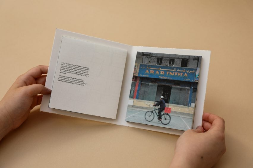
Store-away by Natasha Fernandes
"Store-away highlights the disappearing visual heritage of early expatriates in Qatar's diasporic communities.
"Focused on early Qatari-expat storefront signage, the project addresses the notable absence of the portrayal of these communities within Qatar's historical narrative.
"Employing an archival approach, Store-away captures storefront visuals often perceived as rudimentary or amateur before succumbing to the pressures of rapid urbanisation and modernisation.
"This project not only preserves the cultural heritage of expatriates but also commemorates their invaluable contributions.
"More importantly, it celebrates design elements that once nurtured a sense of identity and belonging to a foreign land."
Student: Natasha Fernandes
Course: BFA in Graphic Design
Email: natashaf2812[at]gmail.com
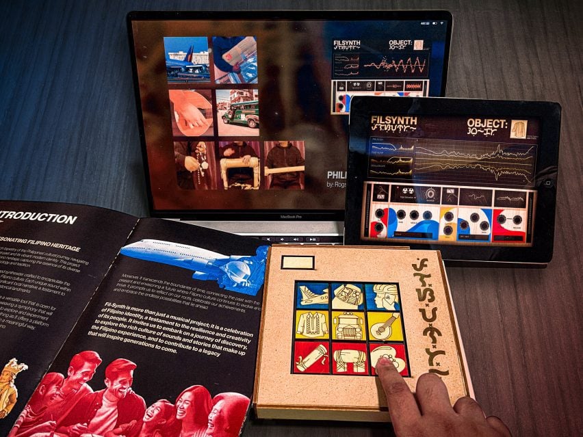
Fil-Synth: Resonating Filipino Heritage by Rogsh Emmanuel Garcia
"Fil-Synth explores the Philippines' cultural evolution between colonisation and modernity.
"Sounds and melodies are presented through a custom-designed synthesiser composed of a series of unique sounds each representing a significant local narrative.
"The synthesiser serves as a versatile tool, inviting musicians, designers and creatives alike to weave together a symphony of significant objects, instruments and people to produce original Filipino music that encapsulates the essence of Filipino identity.
"Through this innovative synthesis of technology and tradition, Fil-Synth not only preserves Filipino heritage but also evokes a profound understanding of what it means to be Filipino, both in the past and in the ever-evolving landscape of the future."
Student: Rogsh Emmanuel Garcia
Course: BFA in Graphic Design
Email: rochimitzu24[at]gmail.com
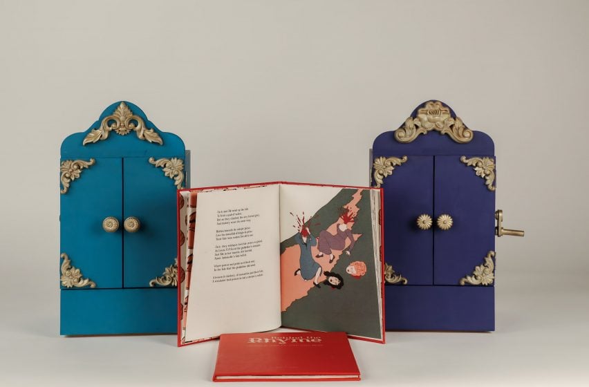
Behind the Rhyme by Aljazi Al-lakhen
"This research aims to expose the overlooked darker side of traditional nursery rhymes through literary analysis and delving into their historical origins.
"Through the act of disruption, this project sheds light on the sinister meanings of these rhymes by highlighting the contrast between the content and the intended audience.
"The implications of this research extend beyond the realm of nursery rhymes, prompting reflection on the evolution of societal norms and inappropriate content developed for children.
"It raises questions about the cultural transmission of values and the impact of early experiences on the adult mind."
Student: Aljazi Al-lakhen
Course: BFA in Graphic Design
Email: allakhena[at]vcu.edu
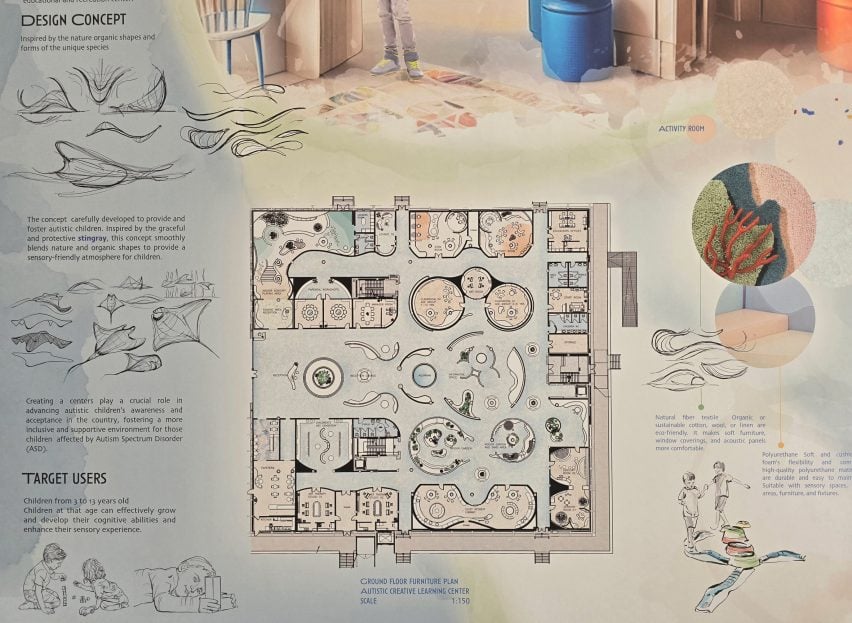
Creative Learning Environment for children with autism in Qatar by Shahd Al Abdulla
"Inspired by the elegance of stingrays, this project – a centre for autistic children in Qatar – marries smooth contours with organic spaces, challenging conventional design.
"This transformation from stark angles to inviting circles is intentional, fostering a nurturing environment that encourages curiosity, exploration and comfort.
"The aim of this project is to create more than just an aesthetically pleasing space – it is about weaving a fabric of meaningful experiences, where growth and exploration are encouraged in every nook.
"Through this approach, I strive to demonstrate how thoughtful design can profoundly impact lives, crafting a narrative of connectivity and depth within the architectural landscape."
Student: Shahd Al Abdulla
Course: BFA in Interior Design
Email: alabdullasw[at]vcu.edu
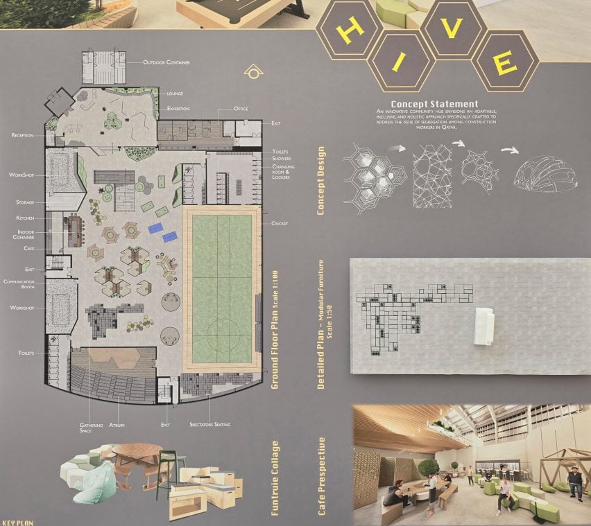
Innovative Community Hub Addressing Segregation Among Construction Workers by Aisha Al-Nasser
"My thesis project is an innovative community hub envisioned as an adaptable, inclusive and holistic space specifically crafted to address the issue of segregation among construction workers in Qatar.
"This project reflects my commitment to using design as a tool for social change and inclusivity.
"My interior design journey is centred on infusing each space with experimental ideas and creating challenges to inform my design thinking process.
"I aim to add pleasure and a sense of purpose to every project and I am passionate about designing environments that inspire and elevate others."
Student: Aisha Al-Nasser
Course: BFA in Interior Design
Email: alnasseraa[at]vcu.edu
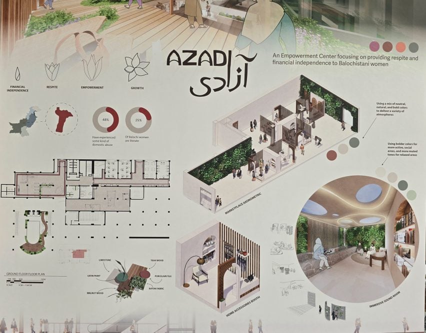
Empowering and Therapeutic Sanctuary for Dependent Women of Balochistan, Pakistan, by Mina Zahid
"My BFA thesis, titled 'Azadi', is a women's empowerment centre focusing on providing respite and financial independence for Balochi women.
"Using primary research, such as interviews with Pakistani psychologists, this culturally driven design not only prioritises their comfort but also encourages psychological improvement.
"I use a multitude of techniques, such as hand sketching, digital renderings and 3D visualisation during the design process.
"My work often has muted colour palettes, soft forms and a contemporary feel to create tranquil environments."
Student: Mina Zahid
Course: BFA in Interior Design
Email: minazahid20010@gmail.com
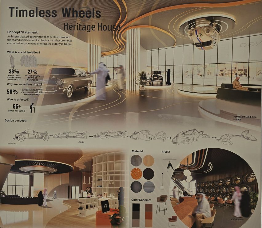
Automobile-focused Gathering Space for Elderly Qataris by Hissa Al-Salaiti
"For my senior thesis, I focused on social isolation amongst the elderly in Qatar.
"Through research, I found that creating an interest-based gathering space encourages socialising.
"'Timeless Wheels Heritage House' is a space designed to welcome and encourage all ages to come together and connect.
"Inspired by my father's timeless and purposeful architectural practice, I strive to design spaces that transcend the boundaries of time and trend, where every element serves a purpose in the form of a narrative guiding individuals through each space."
Student: Hissa Al-Salaiti
Course: BFA in Interior Design
Email: alsalaith[at]vcu.edu
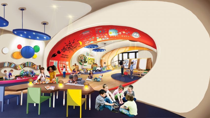
Multi-Sensory Primary School in Melbourne, Australia, Minimising Technology Use by Gowri Maelathil
"My final thesis explores the effect of technology on children's cognitive development through academic research, evidence-based design and interviews with experts in the field.
"This drove my final design of a multi-sensory, colourful and interactive primary school that minimises the dominance of technology and helps foster children's cognitive development, creativity and growth.
“An Indian-born designer and artist who grew up in Qatar, my work is in multimedia format with hand sketching, digital illustrations, collaging and 3D realistic renderings.
"My work is described as bold, energetic, exploratory and whimsical, using vibrant colours and organic forms."
Student: Gowri Maelathil
Course: BFA in Interior Design
Email: maelathilg2[at]vcu.edu
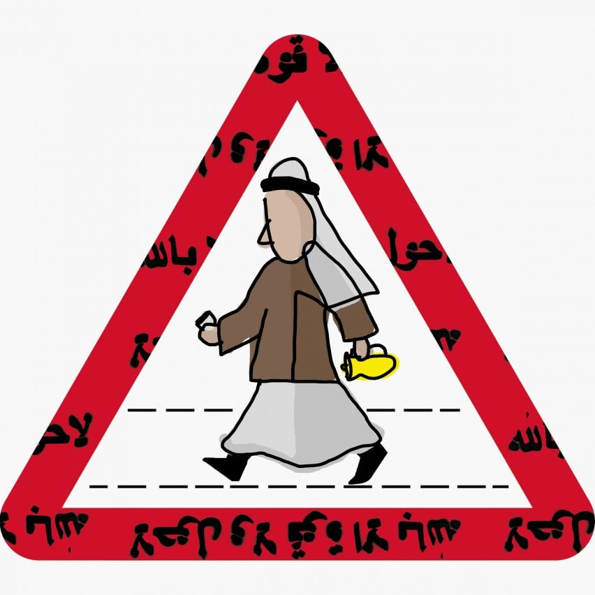
Guidance, Patience, Peace by Shahd Al Muamen
"My research explores how local signs differ in each part of the world – for example, I recognised the use of local attire to depict civilians on the signage.
"I also noticed a number of signs unrelated to traffic placed beside roads, which consist of Quran phrases and sayings and other reminders of how one should behave.
"Traffic signs are posted to create order and protect road users, and similarly, Quran phrases are posted to instruct people on how to live a thoughtful life – a peaceful reminder that a higher power is watching and protecting.
"Whether a believer or not, these sayings are used in our daily language for guidance, patience and peace."
Student: Shahd Al Muamen
Course: BFA in Painting and Printmaking
Email: almuamensd[at]vcu.edu
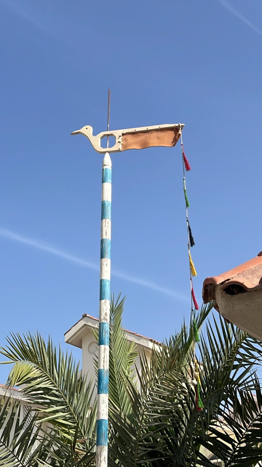
Gliding birds by Khadijah Al-Saegh
"My work revolves around local shipbuilding traditions that have been practised by my family, particularly my father, who passed down his skills as a shipbuilder.
"In this project, I explore the craftsmanship of wooden seabirds used as wind detectors on Qatari sailboats, which are often overlooked in contemporary heritage shipbuilding, whilst incorporating the sail role into the interconnected system with the wind detector bird.
"Through this exploration, I aim to reveal the beauty of these instruments and the profound connection between humans and the natural world."
Student: Khadijah Al-Saegh
Course: BFA in Painting and Printmaking
Email: alsaeghka[at]vcu.edu

I'll do it for me, I'll do it for you by Noor Al-Athba
"I am a Qatari comic artist and illustrator, making short stories that go from scripts to sketches to lines and colours.
"I like to make stories about interesting characters and complex worlds, drawing inspiration from old cartoons on cassette tapes my father got me and the comic books that my middle school library used to keep on the shelves.
"Comics have a unique and amazing ability to convey something extremely effectively with directness and simplicity.
"My thesis follows the theme of resilience and abandonment, where my screen-printed animation expands on a story about giving up parts of yourself to keep someone from leaving."
Student: Noor Al-Athba
Course: BFA in Painting and Printmaking
Email: alathban[at]vcu.edu
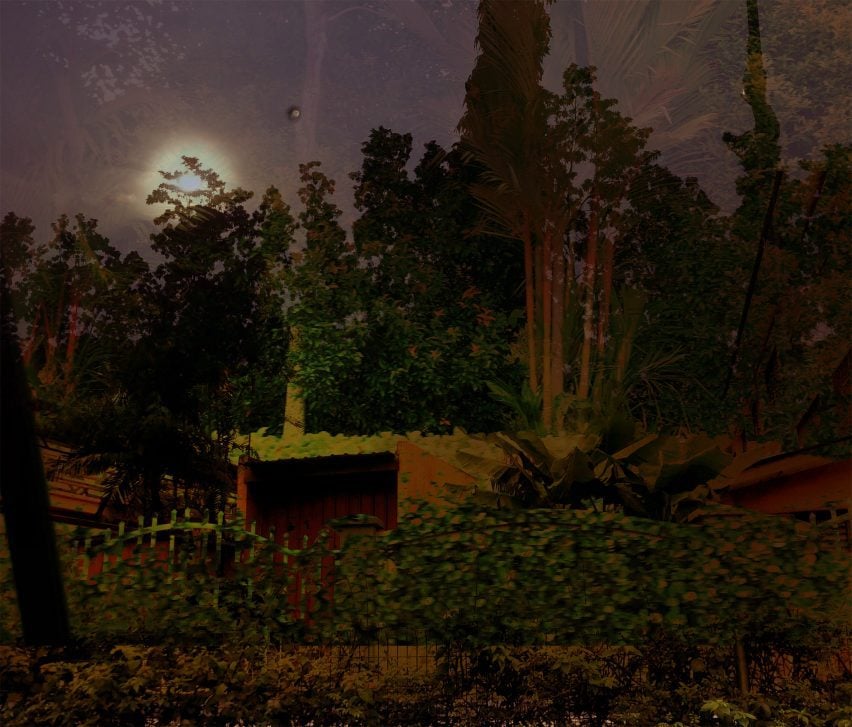
In-between Days by Maryam Picken
"Through the exploration of photography, I look at the compositions that surround me.
"Growing up with liminal cultures and identities, the habit of observing and capturing fleeting moments became a tool for navigating familiarity in different places, such as the United Kingdom, Qatar and Malaysia – countries that make up my identity.
"There are expectations of me to be familiar with these places, yet, I am an outsider – an internal conflict common to people who grew up in multicultural households.
"The repetition of taking similar images in cars, through windows, shadows and reflections, acts as a meditative action that integrates with my memory and examines the control I have in reclaiming parts of my identity."
Student: Maryam Picken
Course: BFA in Painting and Printmaking
Email: pickenm[at]vcu.edu
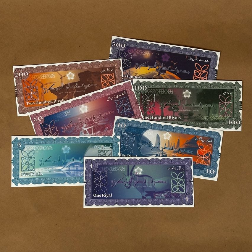
Cultural Currency: A Visual Identity Study and Development through Qatar's Stamps and Banknotes by Kaltham Alfakhroo
"This thesis aims to explore the cultural visual identity of Qatar by examining the history and significance of its banknotes and stamps from the perspective of graphic design.
"These national symbols document historical and cultural narratives such as the nation's economic, educational, architectural, sporting and cultural developments over time.
"Therefore, this project seeks to address a gap in Qatar-focused studies about the history and design analysis of Qatari visual culture and the exploration of national design archives.
"Drawing from primary and secondary research, this thesis presents a range of potential designs aimed at envisioning the future trajectory of Qatar's national identity."
Student: Kaltham Alfakhroo
Course: BFA in Graphic Design
Email: kalthamalfakhroo[at]gmail.com
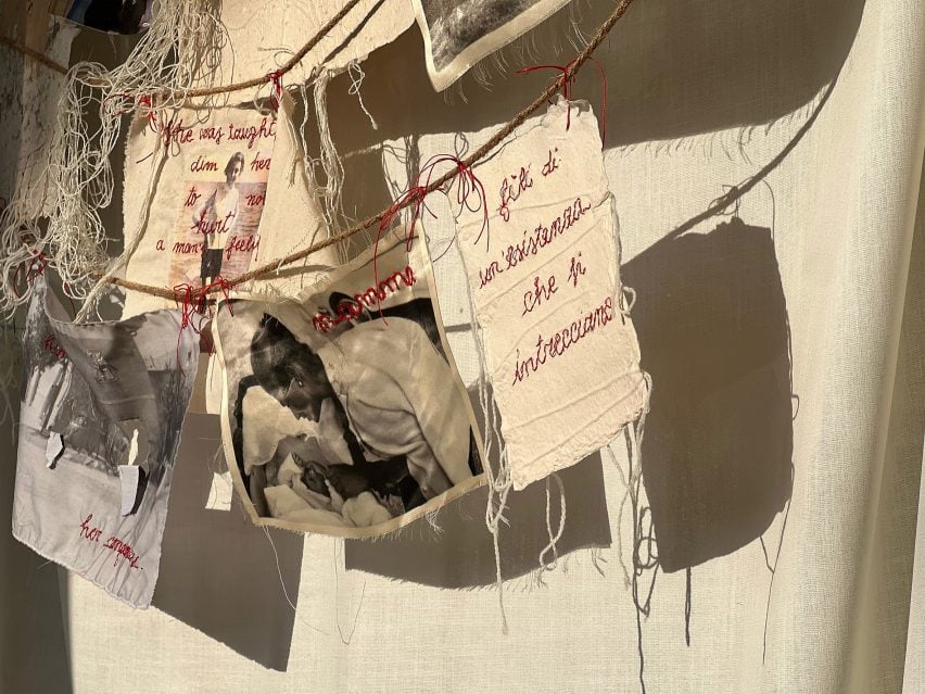
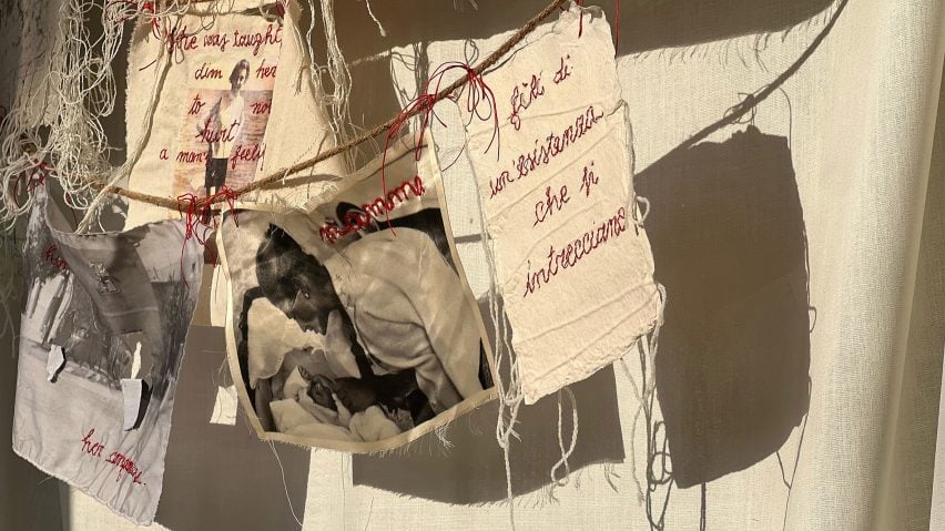
Skin to Skin: A Constellation of Ancestral Love by Valeria Mazzei
"My thesis, Skin to Skin, explores how themes of memory, resilience and vulnerability contribute to the development of our identity.
"The aim is to investigate the profound impact of matriarchal legacy, both challenging and celebrating the fact that women are expected to 'do it all'.
"The project is inspired by my great-grandmother who, though a successful entrepreneur back in the 1920s, was still expected to do the laundry every day.
"Hanging like laundry, my installation is a fabric-woven tapestry that connects women's past and present and highlights the resilience of womanhood, with family photographs (dating from the 1800s and 1900s) and portraits of my foremothers emerging from fibres and handcrafted paper."
Student: Valeria Mazzei
Course: BFA in Graphic Design
Email: valeriamazzeix[at]gmail.com
Partnership content
This school show is a partnership between Dezeen and Virginia Commonwealth University. Find out more about Dezeen partnership content here.